Designing Anomagram

Anomagram is an interactive visualization of autoencoders applied to the task of anomaly detection. I created it as both a learning tool, and a prototype example of what an ML product interface could look like (of course what I cover is a small slice of the entire process). This post discusses design decisions, performance optimization and implementation details for the anomagram web interface.
Visual Design
Some technical details and visual design decisions are summarized below.
Design and Layout
Anomagram is implemented using React.js. Visual layout is prototyped using Carbon design system - an open source design framework from IBM Design. Carbon provides convenient UI components such as Buttons, Sliders, Dropdowns, etc (with support for Vue, Angular, React, Vanilla js) that can be styled to provide an overall consistent user experience.
Reusable Charts and Components
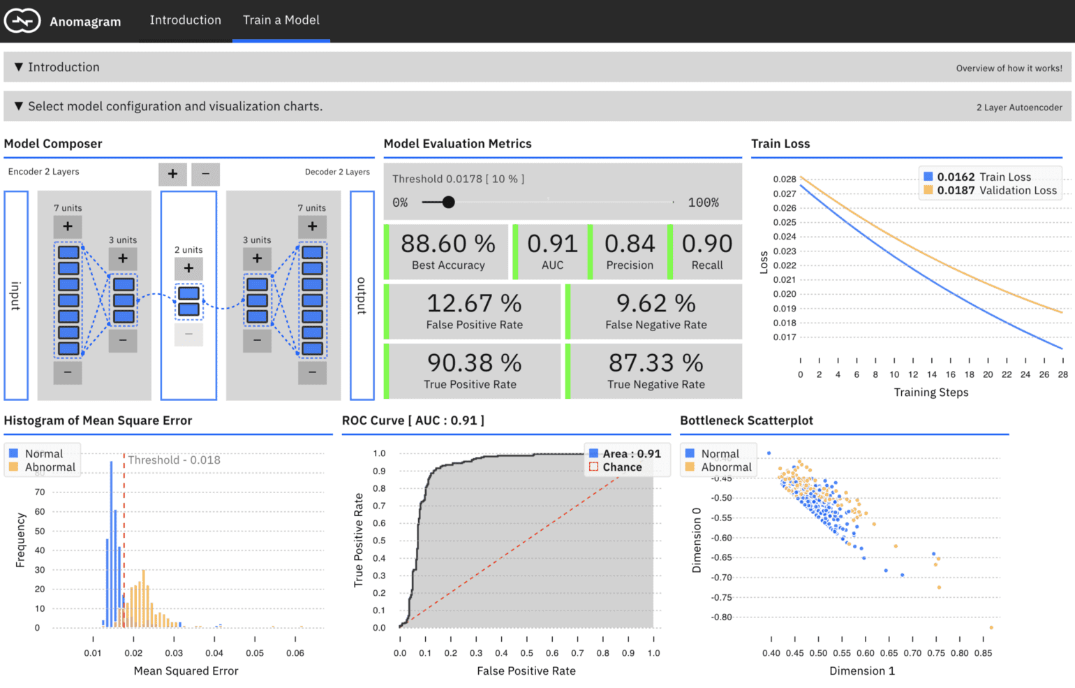
Anomagram presents information using interactive, animated charts. For example, a model composer visualization allows users to visually configure an autoencoder via direct manipulation, an animated line chart visualizes train and validation loss as the model trains live in the browser; an animated ROC chart visualizes the area under the curve as model training progresses; an animated bar chart shows the histogram of errors for test data as training progresses etc. Each of these charts are created from scratch using d3, and bundled as individual parameterizable React components. This way, they can be integrated into several web views.
Visually Communicating Error
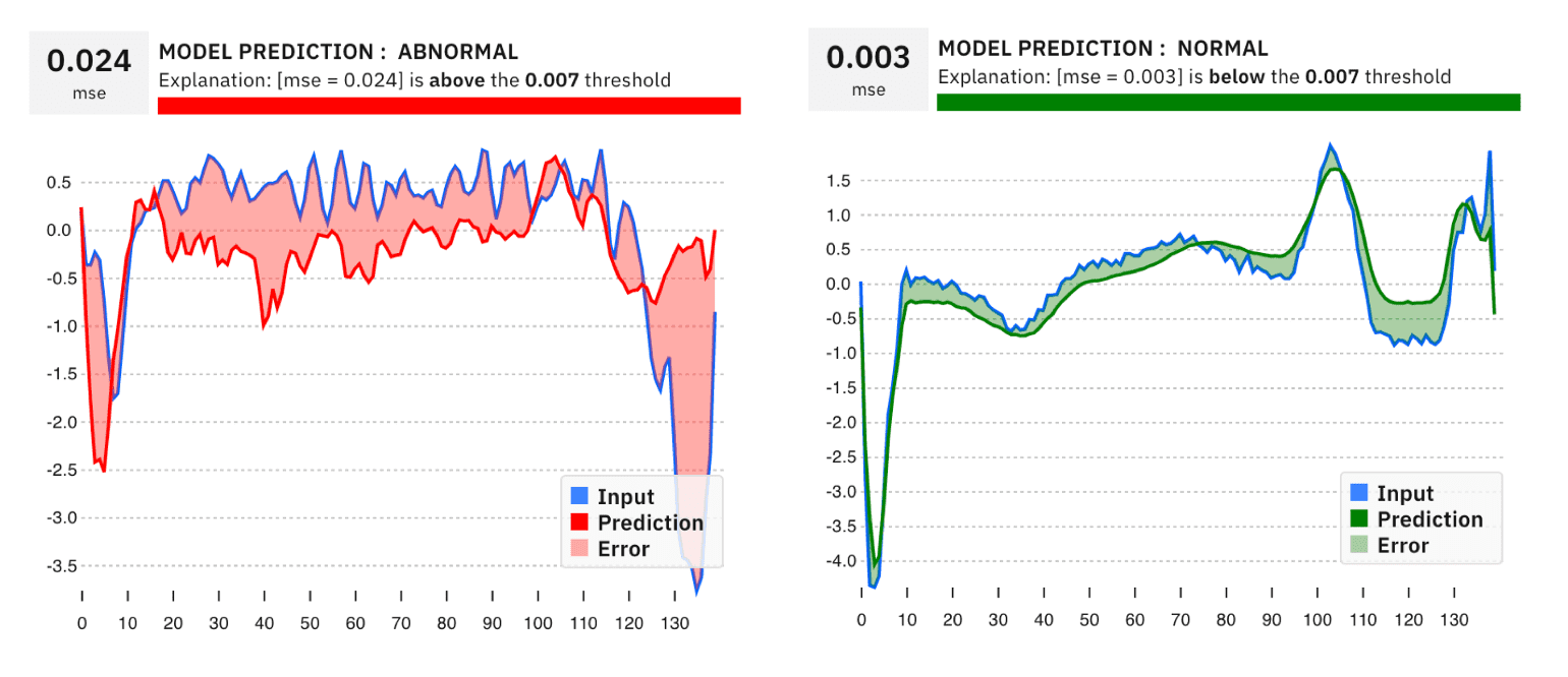
The introduction module demonstrates how an autoencoder works. Part of this is achieved by a visualization of the model's reconstruction error --- the difference between the input data and what the model predicts. It is implemented with a d3 path with filled area and an applied color transparency. It visually highlights sections (area) where substantial differences occur which account for the overall error. By exploring this chart, the user can also observe the shape of signal the model *expects (its notion of normal data) *and hence reconstructs for different input.
Responsive Layout
To facilitate learning/interaction on mobile+desktop, Anomagram layout heavily uses flexboxes controlled with media queries for an overall responsive layout.
Timed Delays for Better UI Interaction
Tensorflow.js operations such as training (model.fit) or inference (model.predict) can be compute heavy. Even when performed in an async manner, they can still interfere with the main thread UI loop. A consequence is that a loading animation initiated just before a heavy call may still not get displayed as all of the UI thread cycles is immediately hogged. To address this, we can use settimeout delays --- start the animation, wait a few milliseconds (e.g. 200ms) before starting a compute heavy operation. This way, the animation loads into memory and is scheduled before the UI thread becomes really busy. There is some active work (see this Tensorflow.js issue) on how to possibly address this issue by running tf.js operations on a webworker. It is still work in progress as Webworkers dont support webgl out of the box.
Attention Cues
For user's without much backing in Machine Learning, early user studies with 4 users suggests navigating Anomagram can be challenging. In addition, it may not be obvious what sort of interactions are possible. In an earlier test, a user did not realize they could click the test data samples to view the models predictions, or did not realize they had to compile the model after each round of changes to the training parameters. To address this, text based cues and instructions were added e.g. "click the sample below to ...". Animations were also added e.g. a pulsing compile button + a message update each time model parameters are updated. These cues help direct attention to the next possible interaction and also help reflect the internal state of the app.
Performance Optimization and Insights

In general, most of the guidelines for designing good web applications apply when integrating machine learning libraries like Tensorflow.js. Notable issues and optimizations are noted below.
Tensorflow.js and Application Load Time
Lighthouse is a great tool for evaluating web applications. After building v0 for Anomagram, the first run on lighthouse showed a performance score of 0. This was mainly because time to first meaningful paint was up to 10 seconds, and overall app file size was up to 8MB. The following guidelines helped address these issues and get a performance score of 100% (atleast while running Lighthouse on localhost and a macbook pro).
- Avoid Tensorflow.js operations before pageload or immediately onload. Tensorflow.js operations work with WebGl shader programs which are compiled lazily and cached for reuse later. TensorFlow.js also stores tf.Tensor data as WebGLTextures which are copied to GPU when the tensor is used. These steps take time (first run can take up to 10 seconds!). If done prior to page load or immediately on load, this can introduce page load delays that are bad for user experience. While it is tempting to perform housekeeping tasks on or before page load such as compile a model, warm up a model, generate tensors from csv/json etc, it is better to defer them with delays or trigger them on user requests. For example the pretrained model used for inference in the introduction module is only loaded when the user makes their first inference request (click a test sample or draws a signal).
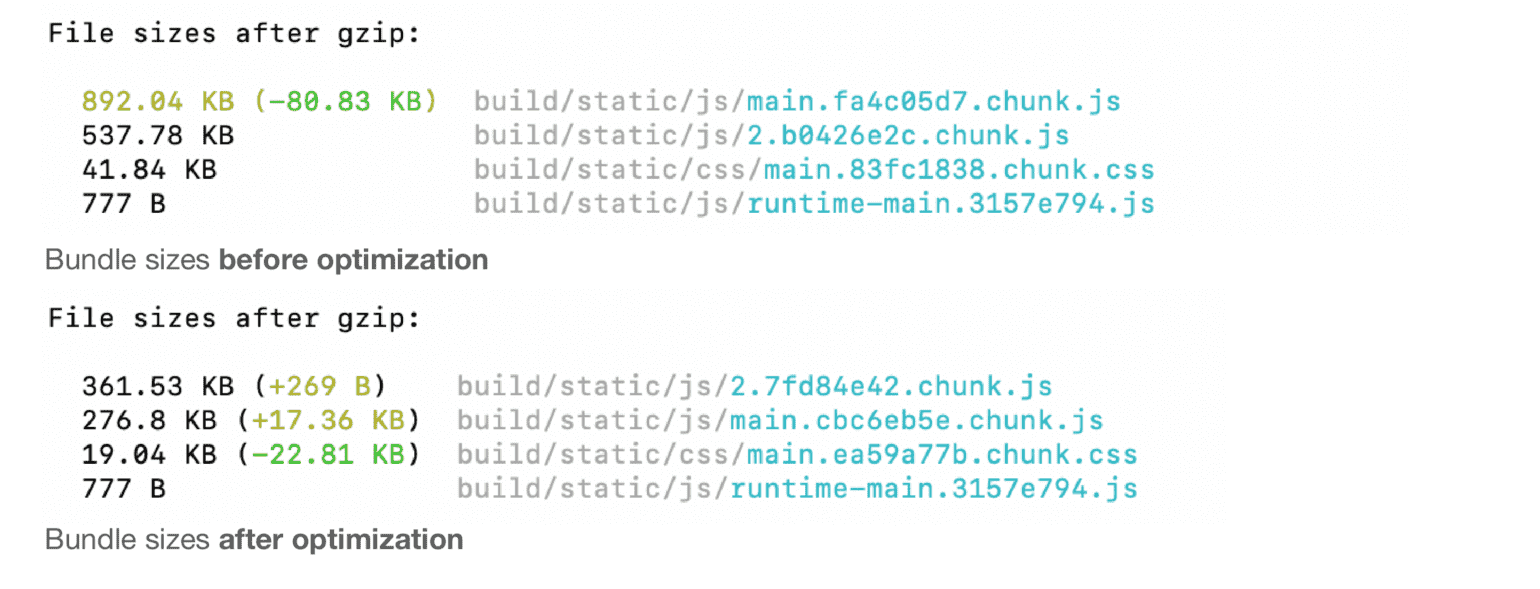
- JSON files and floating point numbers. Aspects of the data used in the interactive visualizations are precomputed. For example, the error histogram data for training runs shown in the introduction module is precomputed and stored in a JSON file. By default, the floating point part of these numbers can be up to 10 decimal places resulting in fairly large JSON files. In this case, this is precision we don't need. One simple optimization is to reduce this to say 2decimal places and suddenly instead of a 10MB application size, we are down to 3MB before gzip!
Manual Memory Management is Required with Tensorflow.js
As part of Anomagram, I have a function that gets predictions, encoder output and computes mean squared error after each train loop update. Each of these processes return a Tensor which is not needed for subsequent steps. These have to be manually disposed of using the tf.dispose() method, otherwise TF.js will hold on to them (and slow down your application after a while). The Tf.js team has provided a nifty method to inspect how many tensors you app is holding on to --- tf.memory(). Ideally, you want to see the values not growing as your app runs. Finally, for react apps, when you switch out a component which uses any tensors, they need to be disposed within the *componentWillUnmount * method .. otherwise .. you guessed it ... it stays in memory!!
File Size Reduction --- Service Workers and Source Map Exploration
The data for training the model is a JSON file (3.9mb). I experimented with a few approaches to loading this file --- we can include it in the React app bundle (using require() ) so it loads with the application . But this increases page load time. Next, we can load the file on demand using a fetch request triggered by the first request to train the model (the user needs to wait a bit at this point). However, each time the train component is requested, the file is loaded again over the network. I ended up sticking with the fetch approach, while also enabling a service worker, essentially making the app a performant PWA. Not including the json file in my build bundle led to about ~45% reduction in overall bundle size
In React, this feature can be easily implemented using the create-react-app base and enabling service workers.
In addition, using the source-map-explorer tool helped me get the css bundle file size from 400kb to 150kb, and js from about 4.3MB to 2.5mb. The tool itself did not perform any optimizations, but provided a way to identify optimization opportunities. e.g. by visualizing the js bundle source maps, the tool highlighted large libraries that were included in the bundle which were actually dead code (e.g the UI shell component in Carbon includes the whole carbon/icon-react library ... extra 1.8mb ... for no benefit at all!).
Numerical (In)Stability on Mobile Devices
Training a model using gradient descent usually requires high fidelity representation of numbers (32 bit Floating point --- FP32) which is necessary for back propagation. Using lower precision representations can lead to numerical instability.
Why does this happen? Recall that Tensorflow.js implements tensors using Webgl textures. On most desktop machines, Webgl supports FP32 textures. However, on mobile, this is not mostly the case, and training can have wildly strange results (in some cases I observed, loss just keeps increasing). With Tensorflow.js you can enforce FP16 computation, but that did not solve the issues. It is expected that the recent progress with a WebAssembly backend implementation for Tensorflow should handle the numerical stability issue. Note that the numerical instability issue does not apply for inference.
Conclusions
In this post, I have discussed rationale for some UI design choices (charts, use of time delays, visual communication of errors etc) and some optimizations that make the app faster and more usable (memory management, file size reduction, testing with Lighthouse, numerical stability issues on mobile). If you have tried Anomagram and find it useful ... feel free to leave feedback! I am also thinking of peeling out some of these charts (ROC, AUC especially since they don't really exist npm) into libraries or React modules that can be reused. Twitter: @vykthur.
References
[1] Suyog Gupta, Ankur Agrawal, Kailash Gopalakrishnan, and Pritish Narayanan. Deep learning with limited numerical precision. In International Conference on Machine Learning, pages 1737--1746, 2015.
[2] Paulius Micikevicius, Sharan Narang, Jonah Alben, Gregory Diamos, Erich Elsen, David Garcia, Boris Ginsburg, Michael Houston, Oleksii Kuchaev, Ganesh Venkatesh, et al. Mixed precision training. arXiv preprint arXiv:1710.03740, 2017.
[3] Smilkov, Daniel, et al. "Direct-manipulation visualization of deep networks." arXiv preprint arXiv:1708.03788 (2017).
[4] Goodfellow, Ian, Yoshua Bengio, and Aaron Courville. MIT Press 2016 Deep learning. Chapter 14, Autoencoders
 Introducing Anomagram - An Interactive Visualization of Autoencoders, Built with Tensorflow.js
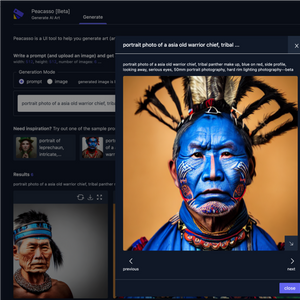 Introducing Peacasso: A UI Interface for Generating AI Art with Latent Diffusion Models (Stable Diffusion)
 2023 Year in Review
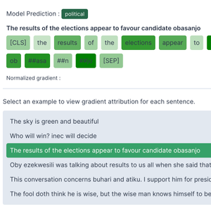 How to Implement Gradient Explanations for a HuggingFace Text Classification Model (Tensorflow 2.0)
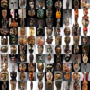 ART + AI — Generating African Masks using (Tensorflow and TPUs)
 2021 Year in Review